Charts
Intended audience: END-USERS
AO Easy Answers: 4.3
Overview
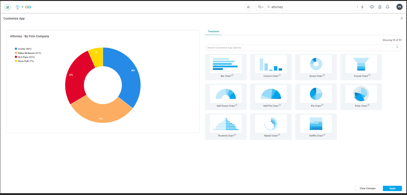
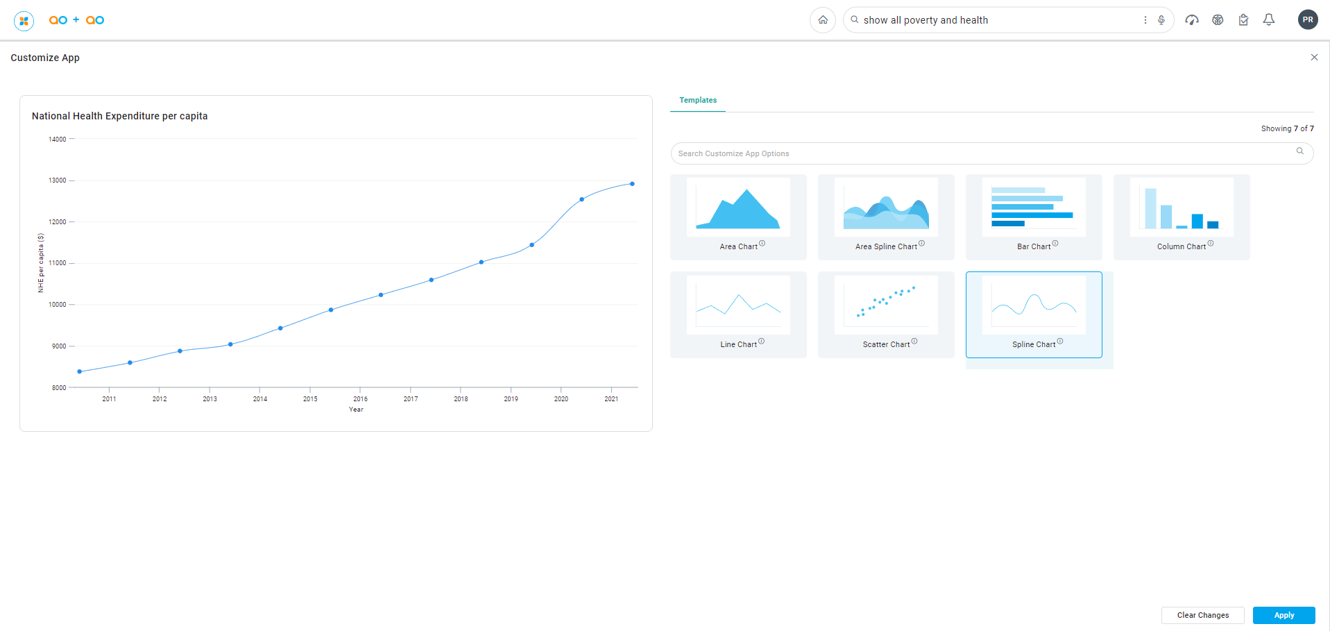
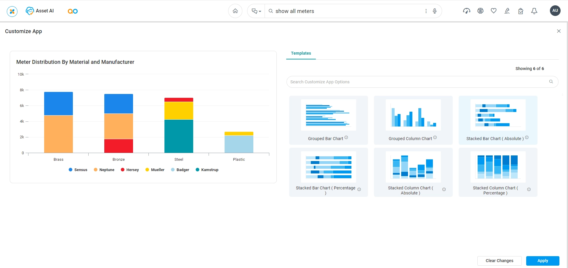
Most data can be presented in many different types of visualizations. Using the Customize App option in the App Options menu, the user will be able to select from one or more alternative visualizations that may suit the data better or just simply be preferred by the user. This page illustrated the options to add alternative Chart style visualizations. The list of alternative visualizations for a given App will expand in future releases.
Examples of Alternative Visualizations
…for Single Series, Categorical, Low Cardinality Data
…for Multiple Series, Categorical, Low Cardinality Data
Once an alternative visualization has been selected and Applied to the Results page, the user can Save the App to a named Dashboard from the App Options menu.