Quick Insights for Correlation (Categories)
Intended audience: END-USERS DATA SCIENCE DEVELOPERS
AO Easy Answers: 4.3
Overview

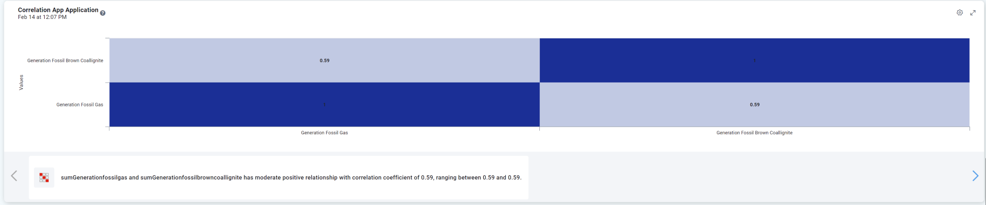
The Correlation for Categories Insight generates a Correlation Heatmap for the series selected.
Purpose
Assess the strength and direction of the relationship between two continuous variables.
Business Example
Understanding the relationship between customer satisfaction scores and repeat purchases.
Scenario
A business wants to know if higher customer satisfaction correlates with increased repeat purchases.
Results
A strong positive correlation indicates that improving satisfaction could lead to more repeat business.
Data Sample
Customer_Satisfaction_Score | Repeat_Purchases |
4.37 | 1.24 |
9.56 | 8.30 |
7.59 | 9.96 |
6.39 | 8.61 |
2.40 | 4.97 |
2.40 | 1.18 |
1.52 | 4.80 |
8.80 | 11.32 |
6.41 | 4.76 |
Example Generated Quick Insight
Example Quick Insight Template used on Insight Feed page
 |  |
Example Quick Insight output with details
End User Configuration - using Easy Answers solution
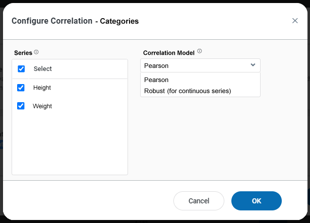
Properties
Label | UI | Default | Description |
|---|---|---|---|
Series | Checkboxes | Select which of the Series in the Chart shall be included in the Correlation. | |
Correlation Model | Dropdown | Select the model to use for the correlation. Robust can only be used for continuous series, but is more resilient to outliers in data.
|