Intended audience: users
AO Easy Answers: 4.3
Overview
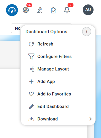
The Manage Layout option for a Dashboard aims to enhance the Easy Answers experience by enabling users to divide a Dashboard into one or more Sections for improved organization and filtering of Apps as well as creating App Groups. Select the Manage Layout entry in the Dashboard Options menu to get started.
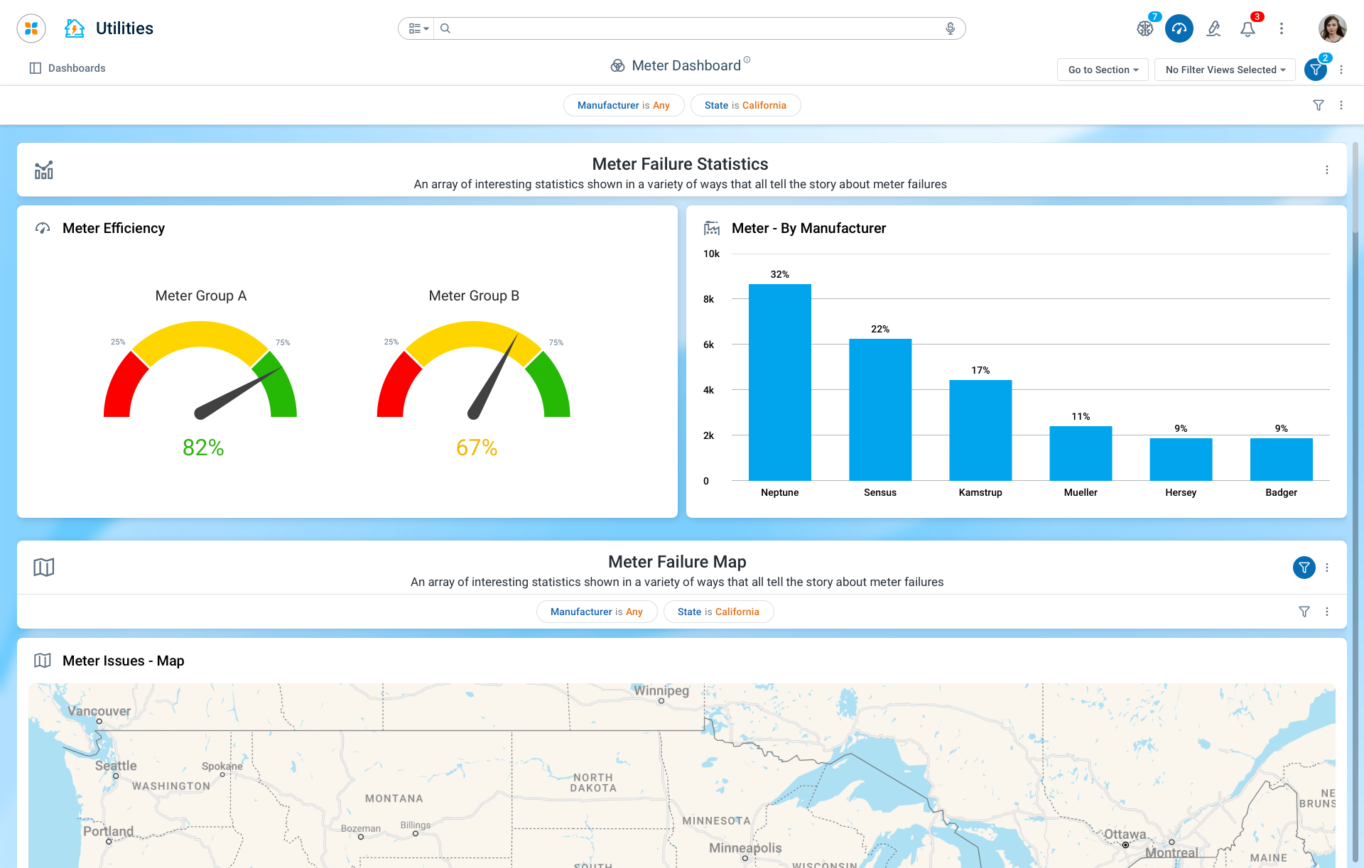
Once configured, the Sections can be seen to divide the Apps on a Dashboard, like in this example:
Creating Sections
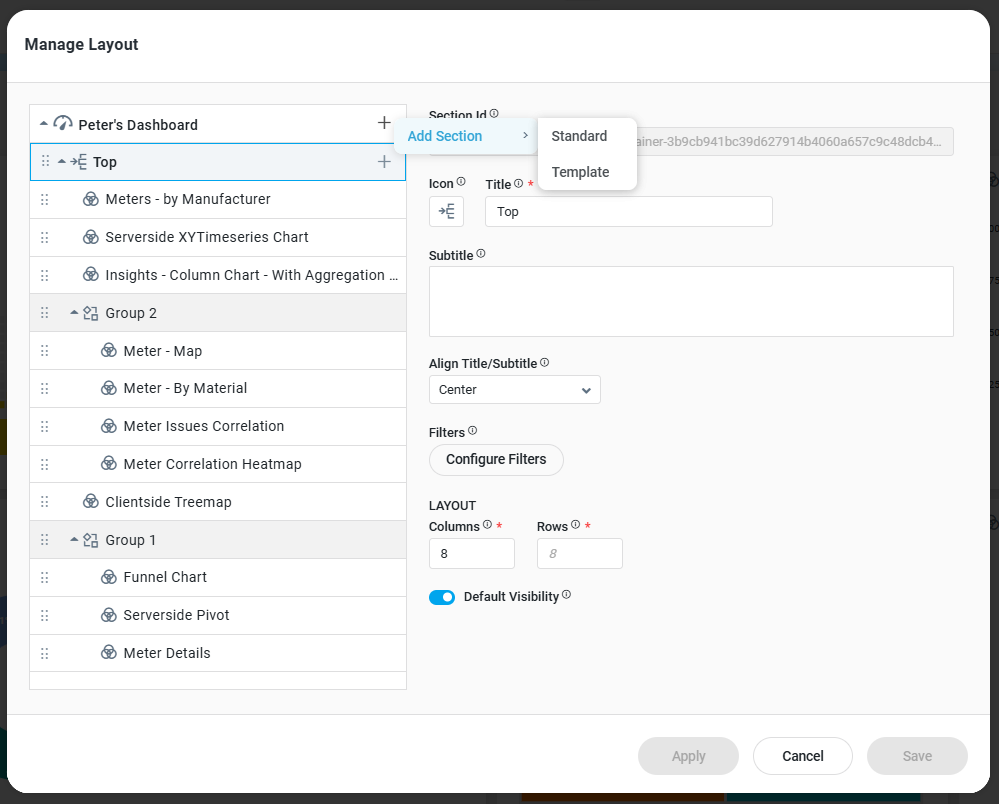
The Configuring Sections dialog provides the necessary configuration properties to enable one or more Sections to be created. There are two types of Sections:
-
Standard - this is a basic Section with simple property configurations for adding an Icon, a Title and Subtitle, and a Layout format.
-
Template - this is an advanced option allowing the user to select a Template-based configuration. Template-based Section configurations can be created by Solution Developers using the Template Composer in the AO Platform.
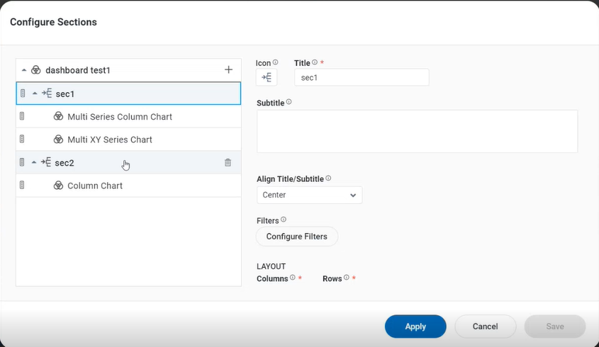
Standard Section
The Standard Section has some predefined components in the Header area of the Section configuration, including an Icon, a Title, and a Subtitle. Finally, the user can select a Layout determining how Apps are shown in the Section.
A Section can have Filters configured. See Configure Filters.
Properties
|
Labels |
UI |
Default |
Description |
|---|---|---|---|
|
Section ID |
Text field (read-only) |
|
Auto-generated static ID field for the section - can be used to refer to the section programmatically. |
|
Icon |
Icon selector |
|
The Icon Selector allows the user to select the icon that represents the section in the section header. |
|
Title |
Text field |
Section |
The Title field allows the user to enter the title used in the section header. |
|
Subtitle |
Multi-line Text field |
|
The Subtitle text field allows the user to enter the subtitle used in the section header. |
|
Align Title/Subtitle |
Dropdown |
|
The Align Title/Subtitle dropdown field provides the user option to select how to align the Title and Subtitle in the Section Header - Left or Center. |
|
Filters - Configure Filters |
Button |
|
The Filters - Configure Filters button enables users to open a dialog specifically to configure filters for this section. |
|
LAYOUT |
|
|
|
|
Number field |
8 |
The Columns field allows user to enter the number of Columns for the grid that is used to place Apps in the Section. |
|
Number field |
8 |
The Rows field allows the user to enter the number of rows displayed on a single screen for the grid used to arrange apps in the section. |
|
Default Visibility |
ON/OFF Toggle |
On |
If enabled, this section will be displayed when the Dashboard is opened. If disabled, the section will only be visible using a JavaScript function that can be added to eg. the Dashboard section. |
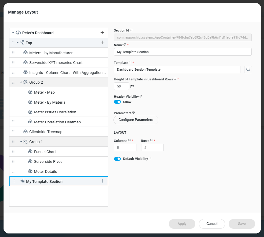
Template-Based Section
The Template-based Section is an option based on the configuration of a Template (created using the Template Composer in the AO Platform) for more advanced use cases. Such a Section can include a customized look and feel, with built-in functionality and user actions. Input to such a Template can be done using the Configure Parameters option.
Properties
|
Labels |
UI |
Default |
Description |
|---|---|---|---|
|
Section ID |
Text field (read-only) |
|
Auto-generated static ID field for the section - can be used to refer to the section programmatically. |
|
Name |
Text field |
Section |
The Name field allows the user to enter the name for the filter view. |
|
Template |
Search dialog |
|
The Template search field allows the user to search and select a Template to represent the Section. |
|
Height of Template in Dashboard Rows |
Number field (value in px) |
80 |
The Height of Template in Dashboard Rows number field allows the user to enter the height of the selected template based on the dashboard's row configuration. |
|
Header Visibility |
ON/OFF Toggle |
ON |
If enabled, allows the Section to show or hide |
|
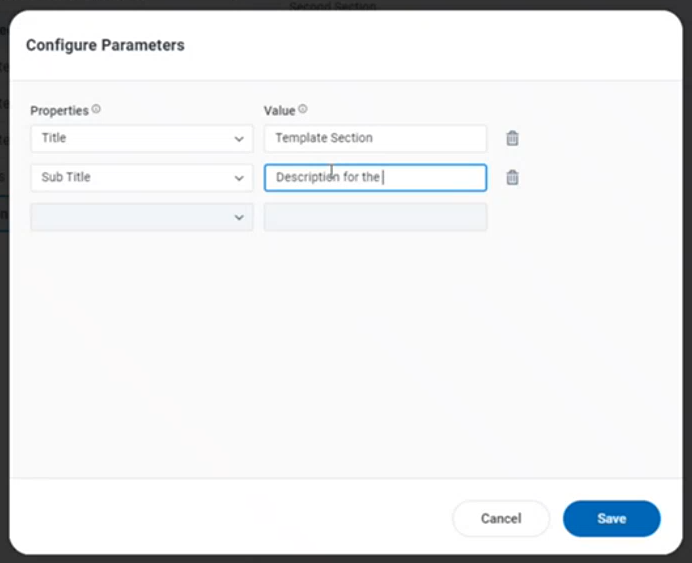
Parameters - Configure Parameters |
Button |
|
The Parameters - Configure Parameters button allows users to open a dialog specifically to configure parameters for this template-based section. |
|
LAYOUT |
|
|
|
|
Number field |
8 |
The Columns field allows the user to enter the number of Columns for the grid used to place Apps in the Section. |
|
Number field |
8 |
The Rows field allows the user to enter the number of rows displayed on a single screen for the grid used to arrange apps in the section. |
|
Default Visibility |
ON/OFF Toggle |
ON |
If enabled, this section will be displayed when the Dashboard is opened. If disabled, the section will only be visible using a JavaScript function that can be added to eg. the Dashboard section. |
Configure Parameters
The Configure parameters refer to the settings that allow users to select properties and values from dropdown menus based on their requirements.
Properties
|
Labels |
UI |
Default |
Description |
|---|---|---|---|
|
Properties |
Dropdown |
|
The Properties dropdown allows the user to select the topic and its corresponding property to create a filter. |
|
Value |
|
|
The Value field allows the user to enter a Display Name for the selected data property. |
Creating App Groups
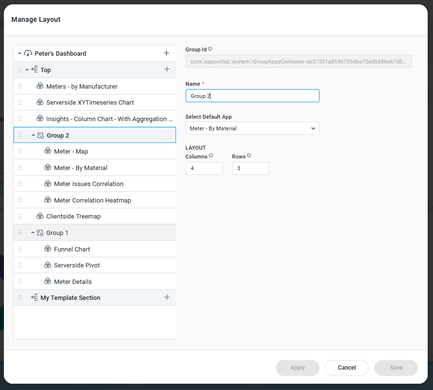
The Creating App Groups helps users create groups for multiple apps - typically where Apps visualize similar data, to improve navigation and accessibility. The Layout Configuration prompts the user to select an App Group Name and the default App for the Group. Finally, the size of the App Group can be configured based on the number of Columns and Rows in the page/section layout.
App Groups as well as Apps within a Group can be shown and hidden using JavaScript functions added in a Header section.
In a group of eg. 4 Apps, only the App that has been selected to be the Default App will be shown on the Dashboard. It’s currently not possible to interactively make the other Apps in the Group visible. This can only be done through a JavaScript function.
Configure App Group
Properties
|
Labels |
UI |
Default |
Description |
|---|---|---|---|
|
Group ID |
Text field (read-only) |
|
Auto-generated static ID field for the app group - can be used to refer to the app group programmatically. |
|
Name |
Text field |
Section |
The Name field allows the user to enter the name for the filter view. |
|
Select Default App |
Dropdown |
|
The Template search field allows the user to search and select a Template to represent the Section. |
|
LAYOUT |
|
|
|
|
Number field |
8 |
The Columns field allows the user to enter the number of Columns for the grid used to place Apps in the Section. |
|
Number field |
8 |
The Rows field allows the user to enter the number of rows displayed on a single screen for the grid used to arrange apps in the section. |
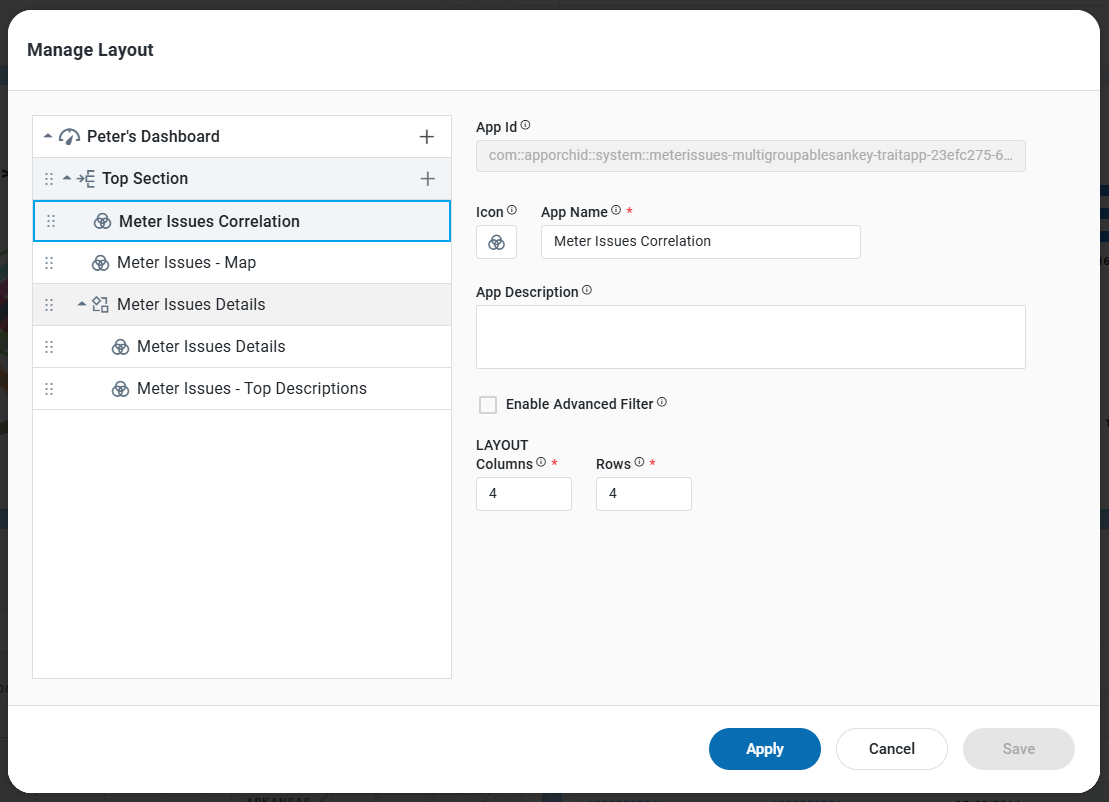
Configure Apps
Clicking an App allows the user to edit the configuration properties of the App.
Properties
|
Labels |
UI |
Default |
Description |
|---|---|---|---|
|
App ID |
Text field (read-only) |
|
Auto-generated static ID field for the app - can be used to refer to the app programmatically. |
|
Icon |
Icon selector |
|
The Icon Selector allows the user to select the icon that represents the section in the App. |
|
App Name |
Text field |
Section |
The App Name field allows the user to enter the App name. |
|
App Description |
Text field |
|
The App Description field allows the user to enter the App description. |
|
Enable Advanced Filter |
Checkbox |
Unchecked |
The Enable Advanced Filter checkbox allows the user to enable the advanced filter option. |
|
LAYOUT |
|
|
|
|
Number field |
8 |
The Columns field allows the user to enter the number of Columns for the grid used to place the App. This field is read-only if the App is placed inside an App Group. |
|
Number field |
8 |
The Rows field allows the user to enter the number of rows displayed on a single screen for the grid used to place the App. This field is read-only if the App is placed inside an App Group. |
Actions
-
Save - click the Save icon to save all sections.
-
Apply - click Apply to refresh the Apps on the Dashboard configured to be impacted by the configured sections.
-
Move Section - see below.
-
Move App - see below.
Moving Sections and/or Apps
It’s possible to move both Sections and Apps around on the Dashboard using two different approaches:
-
Using the Configure Sections dialog, the left-side panel can be used to move both Sections and Apps.
-
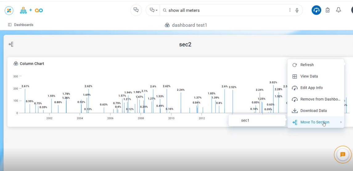
Using the Move to Section entry in the App Options menu allows moving an App from one Section to another.
In the Configure Sections Dialog
-
Click and hold the App you want to move, then drag it to the desired section simply by pulling the drag handle to the left of each entry
In App Options Menu
-
Click on the Options menu on the app.
-
Choose the Move to Section option from the menu.
-
Select the Section in the submenu where to move the app.
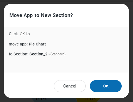
When moving an App to a different Section, a dialog will prompt the user to confirm the move.
Contact App Orchid | Disclaimer