Intended audience: users DEVELOPERS ADMINISTRATORS
AO Platform: 4.3
Overview
Properties are the elements across all components in an object that can be configured to make the components look and behave in a certain way. Properties are generally categorized, especially where there are numerous properties for a given components. This topic seeks to bring insight into the different ways properties will appear within the Property sections.
When an object is created/edited within a Composer, the Design screen will typically have a Property Details panel on the right-side of screen. This panel uses the following organizational principles:
Basic and Advanced Properties
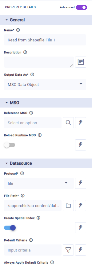
A toggle (or tabs) will allow you to switch between Basic and Advanced properties:
-
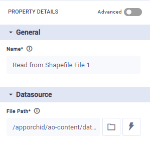
Basic - the properties shown are typically the minimum configurable properties required to make the component work.
-
Advanced - all properties are shown whether configuration is required or not.
|
|
Organization of Properties
For components with a smaller set of properties, only one column will be shown in the Property Details panel - as seen above. This column will have collapsible/expandable categories of properties for easier understanding and access.
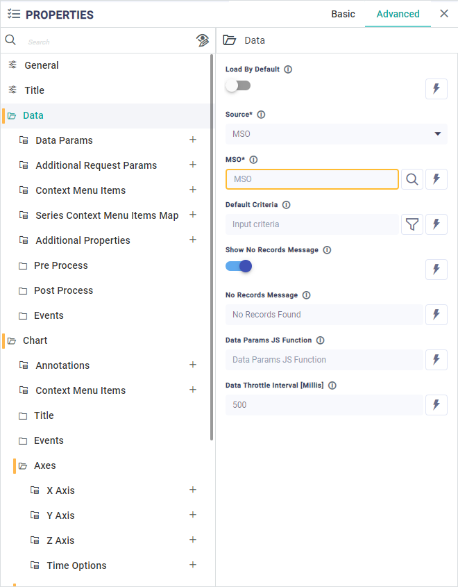
For components with a large set of properties, typically found in the Application Composer, a separate column is shown in the Property Details panel showing only the categories. User selects a category in this column first, then configures the properties in the 2nd column - as seen here:
Configuration of Properties
Properties can be configured in a number of different ways supported by different UI widgets. The example below shows some common configuration options with help from the UI widgets:
-
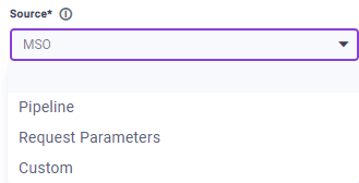
Selecting MSO Properties - from dropdown.
Wherever MSO Properties are shown in a dropdown for selection, the following additional “decorators” may be seen:
-

-

-

-

-

-

-

-

-

-

-

-

-

-

-
-
Searching - from repository of components/objects. See Searching.
-
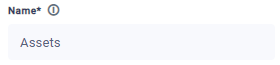
Adding a value - most common form of input. Simply add your text or a number value into the field.
-
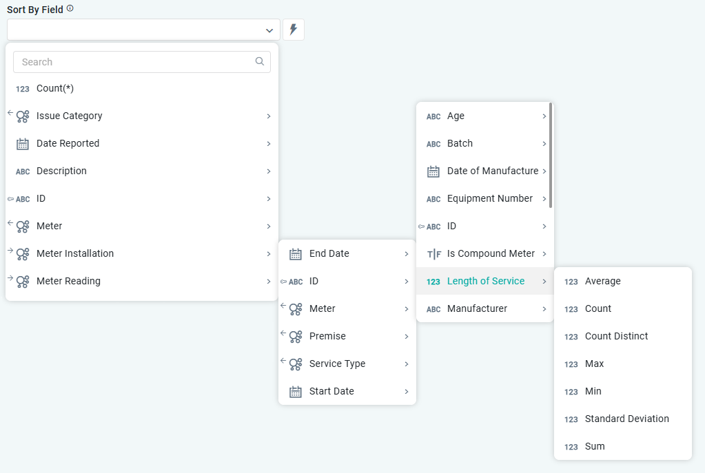
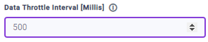
Selecting value - from a dropdown of predefined values.
-
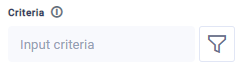
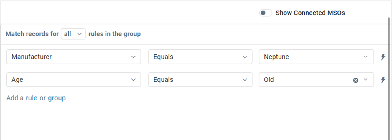
Using Query Builder - to create a criteria-based configuration. See Using Query Builder.
-
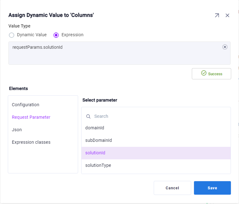
Using Expressions - to create a dynamic configuration that is only resolved at runtime. See Using Expressions.

-
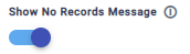
Using a Toggle - typically represented using either an ON/OFF slider or a checkbox.
-
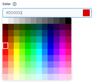
Selecting value from Palette - such as a color palette.
-
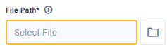
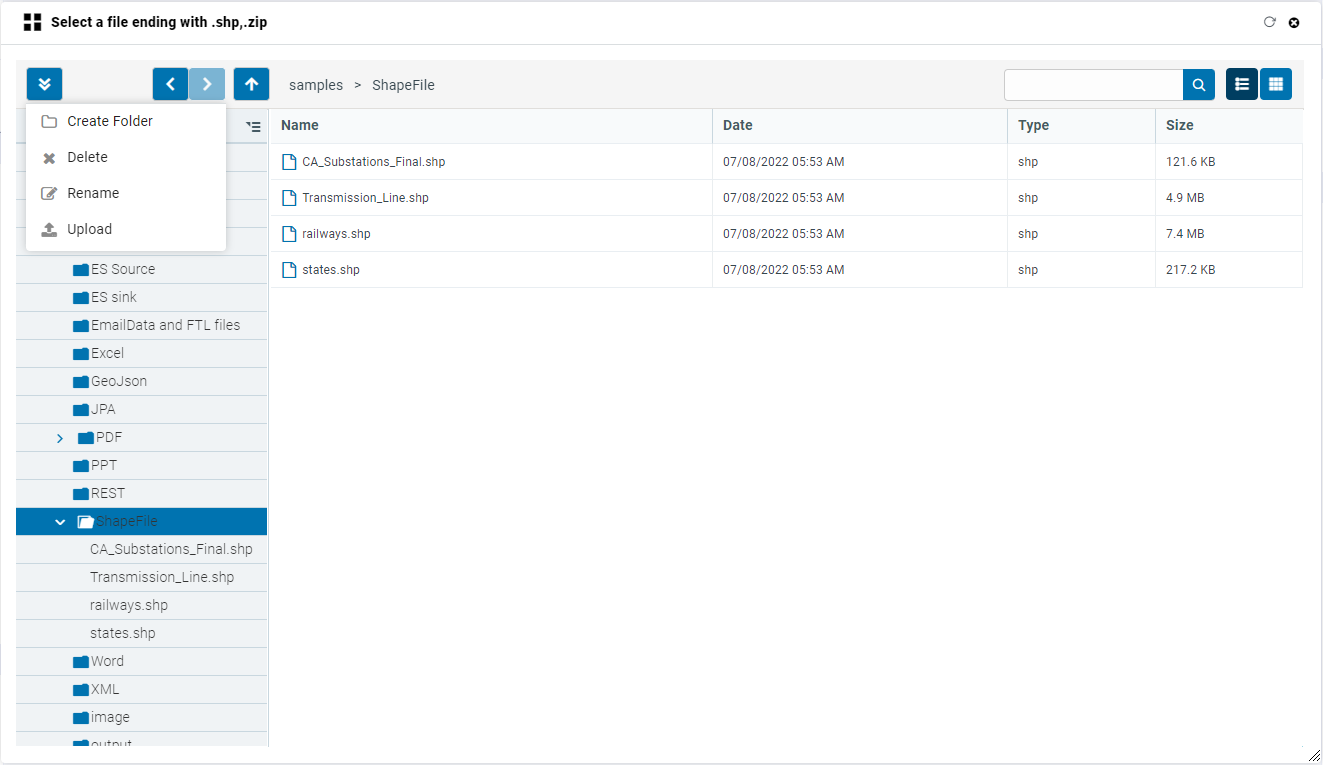
Using File Manager - allowing user to select from a number of existing resources, such as icons, images, data files, and/or upload new resources.
-
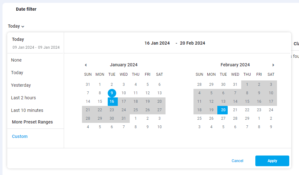
Selecting a Date - in most cases, the user will be allowed to select from preset values, a single date or a date range.
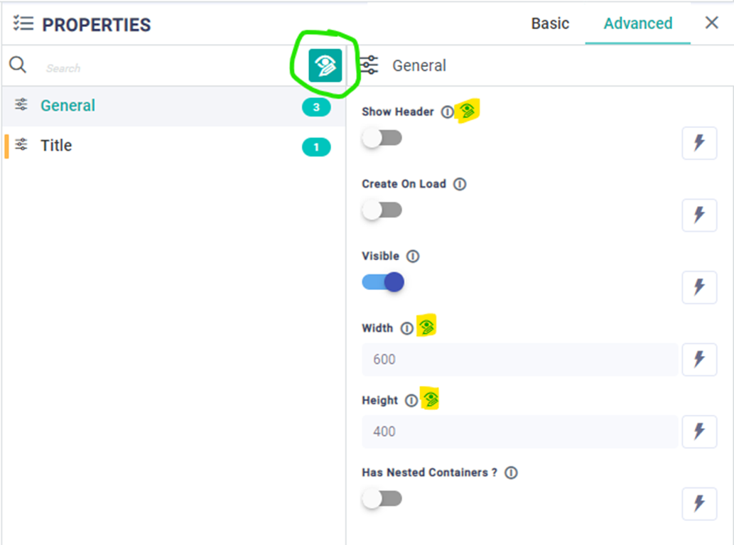
Default vs User Configuration
This option is a great productivity and debug feature. In the Properties panel, look for this 
Contact App Orchid | Disclaimer